Monday, March 12, 2012

long time no see..

It's been a while since I have posted anything on the ol' blog, so here is some recent work.


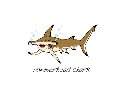
These pieces came from a series of work I did for some children's rooms. One room featured a shark theme (the other two pieces were a thresher shark and a wobbegong) while the other centered around turtles and tortoises (the other piece in this theme was a triptych featuring a softshell turtle, a galapagos tortoise, and a big-head turtle). It was interesting keeping the style child-friendly while retaining some realism. The finished pieces were matted and I actually inked various creatures and plantlife on the matting itself.


This one is a tribute to dear old Tybee Island. It was good practice for creating illustrations from scratch in Illustrator.

Thursday, May 19, 2011

that ol' thorny devil..


Just wanted to throw up an old ink drawing of a thorny devil lizard I did a while back. I actually did end up digitally rendering this guy, but I truly preferred the simple contrast and line purity of the original here.

2 years or so later...


With this post, I am hereby restarting my artblog!

For my premiere piece I present to you the love of my life, Gwendolyn Marzano.

I completed this piece as birthday gift for her upon her request for an illustration of her donning the full armor of God from Ephesians 6:10-17. I began with the traditional line work of pencil then ink, and then utilized some acrylics in an almost watercolor approach. Anyone who knows me as an artist understands that I just love iconographic halos and so we have one featured on Gwen as well. What can I say, she's my angel after all!

Thursday, November 5, 2009

tatoo designs...


Cheerio...

I thought in case anyone has not seen the original work for my tattoo designs, and also so people can see the one I made for Brandon, I'd make a posting for those...

The first is the cherub design final...for an explanation see the earlier entry about it..

The second is the seraph design...

The second is the one I designed for Brandon for his right upper back. At its core, it symbolizes the twin-ship he shares with his brother Brandon. Of course, in Lane fashion I incorporated much latent symbolism and research to form this composition. It is centered around the myth of the Greek twins Castor and Pollux: their mother was raped by Zeus in the form of a swan and they are said to have hatched from an egg(s), also said to have been adventurers and often helmeted. I also gave them corresponding wings in reference to their swan relation and for an aesthetically more pleasing composition. The entire composition of the hatching from the egg is also a reference to Brandon and Andrew's favorite painting, Dali's "Geopoliticus Man".

I'm hoping to do more tattoo design work, and am currently in the process of designing two for a couple of other friends. I'll post that material as it manifests..

Monday, September 14, 2009

a series of art, an exodus, and the aftermath...


G'day.....


Lots of major life changes since I last posted..


I am once again an official Houstonian and also unemployed....which I havent been in quite a long time. Job hunting is proving to be difficult but it is still early to give up too much hope yet. Seriously considering focusing on a teaching route....


The thesis show went quite smoothly, and I am quite satisfied with the pieces I created for it. While much of the in-progress art has been featured here, it would be wrong not to put up the culmination of much hard work. And so, here they are in the following order :


1 and 2 : These two are an album poster and a shirt design for the drone ambient duo Hammock. With Hammock being a band almost completely instrumental with very little vocals and lyrics, I chose to draw from their latest album title "Maybe They Will Sing for Us Tomorrow" and the overall feel of their music. Hammock certainly has an encompassing and ephemeral quality to their music, like a flock of Canadian geese across a winter sky. To represent this feel, for the poster I came up with the image of a fair girl staring through an old window pane, her hand pressed up in the glass in a thoughtful and introspect gesture and expression. The shirt design works as progression with the girl now absent and departed, leaving behind only a handprint as a legacy.


3 : This piece I came up with late in the series. This one is show poster for the band "A Northern Chorus" a thoughtful and beautiful indie band from Canada. The inspiration for this piece comes from their song "Winterize", specifically the chorus : "Pockets full of spent bullets, old train tickets, and pictures of the sun that couldn't warm up those winter eyes". The concept was the simple idea of taking the phrase "winter eyes" and creating my own visual representation. In this instance, it features a maiden with cold blue eyes and tears that have become snowflakes from their icy chill. The snowflakes were actually hand made using the classic method from childhood.


 cont. previous entry...

a series of art, an exodus, and the aftermath...cont


The other three pieces....

4-6 : These three pieces are the designs I made for Oh, Sleeper (christian hardcore band), the first two being shirt designs and the third being a show poster. They center around the lyrics and themes of their first album "When I am God" which follow the struggle against the flesh and the spirit through a war and battle analogy. Of particular note was the final song "The End of a Dark Campaign" which presents the allegory of being wounded in battle, calling for the medic, and the choice to lay down in defeat or get up and continue the fight (derived from the lyrics "Lay dead or charge the line") symbolizing the personal war against our human nature. Thus the three soldiers represent three choices: the two with the X's (from the slaughterhouse mark placed on the doomed animals) have chosen to accept defeat, and the third (the X has now become a cross representative of the medic and Christ) taking arms again to press on despite his wound.

Although I am a very harsh self-critic, I must say I am quite satisfied with this body of work especially considering it is my first foray into art for band promotion. I only hope now that someday I may actually be able to do this as a career.

Wednesday, August 12, 2009

old window frame + Raychel = Hammock


well folks, its coming down to the wire here, but I finally have an ultimatum....August 29th...
Upon this day shall be my grand thesis show, and If you are in Savannah you should most certainly come..Im treating it as a goodbye sort of thing too since I leave 2 days later...

Here are the first glimpses of the Hammock piece I am working on...the first image is the design for the poster and the second is for the shirt...I may add another element to the poster design...and of course there will be the text too which will be a handwritten format...

Lots to do still, but its nice to have a deadline finally even though its frighteningly close...